"Do not fix it if it is not broken” - Absolut Vodka re-design
Absolut Vodka is one of the most famous vodkas, and has recently undergone through one of its major design changes since its conception. Most of us know the brand, but probably, just like me, you didn’t know much about their history. So, in other to be able to talk about the re-design, I thought it was best to dive a bit into its history.
The brand dates back to 1879 when Lars Olsson Smith, its inventor, introduced the spirit drink in Åhus, Sweden as "Absolut rent Brännvin" -"Absolutely pure vodka"-. In 1917 the vodka was monopolised by the Swedish government, and it was sold nationwide under the name "Absolut rent Brännvin". Then the name changed overtime ("Renat Brännvin" or "Absolut Rent Brännvin") until 1979, when the old name “Absolut” was picked up when the brand was introduced in the US. A few final changes were applied to the 1879 bottle design: the Lars Olsson Smith’s medallion was added, and the neck was elongated. On April 17th 1979 the first shipment from the distillery in Åhus, Sweden, was dispatched and arrived in Boston two months later. It was the beginning for a local Swedish brand to become one of the top ten most renowned vodka brands in the world.

First bottle produced, and the blue print of the bottle introducing the medallion and longer neck (based on an apothecary bottle).
Since then, Absolut Vodka has revolutionised the category introducing over ten more flavours to its portfolio. When it was first launched globally in 1980, the packaging design have already redefined the premium vodka category with its design uniqueness and creativity. The bold sans serif typeface used for the brand-mark, the script copy on front of pack that became iconic to the brand, and the bottle shape based on the apothecary, are all recognisable brand assets that have built, alongside the advertising communications, the Absolut Vodka identity.

1980 famous bottle design, and first global campaign by Geoff Hays of the TBWA ad agency in New York.
There have only been slight changes to the packaging design throughout these years. At some point the copy in script changed to a shorter version, but it still kept the same typeface and layout structure. Its iconic design remained intact.

Script copy alteration at some point after it first design in 1980
But then, in 2015, the design went through a major change executed by the Brand Union. The brand-mark was updated to a two line logo, no longer featuring the “Country of Sweden” script in between the brand name. The typeface was tweaked with the addition of a few returns at the ends of the characters to emulate, subtly, a serif font, and then the typeface from the script text was re-designed entirely to hold a completely different message (but still related to the brand’s spirit and origin).
Absolut Vodka design up until 2015 and 2015 re-design version.
“It was a major re-design that kept the essence of each one of the packaging assets with a subtle but completely different look.”
It was a major re-design that kept the essence of each one of the packaging assets with a subtle but completely different look. Yes, the brand-mark typeface changed, but as subtle as it is (it remains until today), you can hardly notice it; the medallion was polished to look a bit neater with a new typeface and a new illustration of the creator; and last but not least, the message in script was simplified to describe the “One Source” philosophy: “One source. One Community. One small village in the South of Sweden”. The only thing that wasn’t kept was the “Country of Sweden” statement as part of the brand-mark. It was a weird strategic move to unlink the brand to Sweden. Maybe, they thought that as Sweden was already in the new script “Once Source” message, so then, there was no need to having it twice. Regardless, the brand-mark was no longer connected to Sweden.
As major as it was, and even with the latter comments made, the Absolut Vodka packaging design never lost it’s course. The brand never felt compelled to change its design to be trendier like many other brands. It stood by its heritage and kept going that way because they knew they were being true to the brand, their history, and the consumers (until today?).

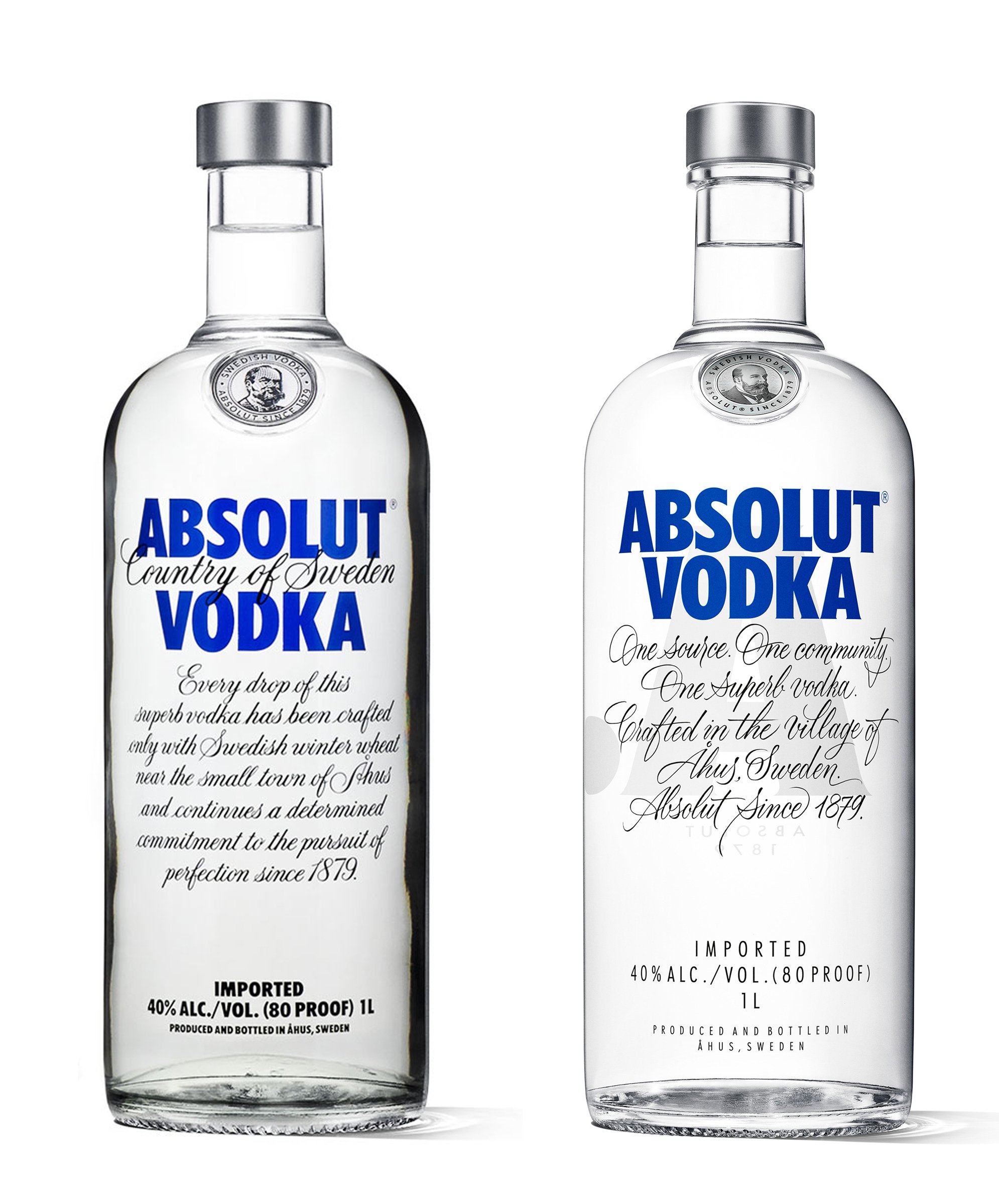
Absolut Vodka 2015 design vs 2021 re-design.
In 2021 Absolut Vodka introduced another re-design executed again by the Brand Union Stockholm, and this move was bold. The design on its own has a brilliant execution. With great attention to detail, the design studio produced an exceptionally crafted design.
The bottle shape has been tweaked slightly. The brand-mark was enlarged to gain more impact on pack. The seal stamp with Lars Olsson Smith illustration was simplified even further stating only his name and the date of Absolut Vodka first production. “Country of Sweden” was brought back into the front of pack but this time engraved on the glass bottle with an embossing technique so it could produce a tactile sensation when holding it. Then, one of the two boldest moves was to replace the script copy with just a simple “Swedish Vodka”. And last but not least, is the addition of a paper label with some information about the product: alcohol graduation, batch number, etc.
“The design on its own has a brilliant execution. With great attention to detail, the design studio produced an exceptional-crafted design. “
So, now let’s go into detail…
I wont’ go into the bottle shape changes as I am not an industrial designer, but from a visual experience I have to say it looks pretty much the same. There are subtle changes, however, the new one feels a lot sleeker.
The larger brand-mark looks very powerful. It has a nice balance between the size of the bottle and the area where it sits next to all the rest of the graphic elements. I love the simplicity, although, I have to say, I kind of miss the sans-serif version with “Country of Sweden” in the middle. It was such a characteristic element and also it connected the brand name to its origins. I always thought it was a nice touch and it looked great.

2021 new bottle design details.
The new inscription “Swedish Vodka” looks really nice, and they are linking Sweden to the brand name again, which is great. The hand-written typeface is so much better than the previous versions. It looks (and is) hand-crafted, therefore it conveys the message of something unique, with a human touch (it probably wouldn’t work on a longer copy, but for a two word message works just fine). And then, more importantly, it simplifies the message they have always been communicating: it is a Swedish vodka that is only being produced in Sweden. But now, on the other hand, I have to say that although as a stand alone element is has a great execution, and they are linking the brand name to its origins again, now the bottle is missing that black mass of copy that has built that brand uniqueness all these years. I have always seen that copy as part of the brand-mark (although it isn’t). It is not just the message or the fact that it is a script typeface, it is how that mass of copy interacts with the rest of the elements creating a unique layout. A brand-mark with a hand-written tagline is something that we have already seen in so many other brands, that now seeing in it here, it kind of disappoints me. Absolut Vodka has lost that touch that made it unique. The whole script paragraph was an element on its own. It wasn’t just a long copy, it was a brand asset, and now it is gone.
“Country of Sweden”, that it was always linked to the brand, now is physically part of the bottle: it’s embossed. It’s a nice touch that produces a physical experience, and, of course, elevates the perception of the product. But, although I like all this, I have my doubts because now the “One source” message is repeated twice on front of pack and almost with the same level of impact. I say almost because, although they occupy the same amount of space, “Swedish Vodka” stands out a bit more because is in black.
The seal stamp was simplified as we said before. It was stripped of the keylines and the grey background. It is transparent now. As a design element it looks nice, however, someone could say that it looks less as a stamp now because of all the graphic attributes that are no longer there. And it doesn’t stand out as much as before, allowing the brand to have more visibility and less elements competing, but the message that a seal stamp conveys from a quality point of view is now gone, I think.
And finally, the addition of the paper label with all the information. It looks considered, elegant and sleek. I can’t say it hasn’t been well crafted. It was probably added to emulate the label an apothecary would have used to label his product. But despite all the storytelling the label creates, it makes me doubt if it was a good move in the re-design. Why? Well, probably because so many other brands in the spirits drinks category do the same and Absolut Vodka was always unique because it was different to every other brand.
I fear that they have degraded the Absolut Vodka packaging design uniqueness with all these well executed changes, but not probably well considered from a brand positioning point of view.
And how does Absolut Vodka look among other vodka brands?
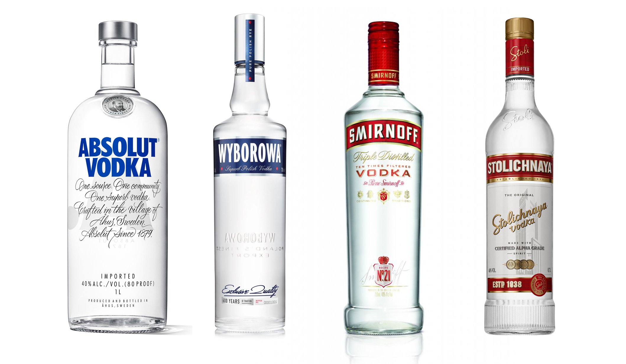
As an excercise, I have placed the Absolut Vodka bottle design next to some of the international competitors matching the design the design over time.

Absolut Vodka and competitors bottle design back in 1980.
It was 1980 and Absolut Vodka was launched in the US becoming a global brand like we mentioned already: so I placed their original design with some others from the same year. When you look at the line up I think it is clear how Absolut Vodka was standing out in the category with a packaging design with its own visual language which was distinctive, unique, and therefore, stood out from the competition. When everyone else was using a printed label with metallic foils and inks, Absolut Vodka was printing its graphics directly onto the bottle to deliver a see-through label. This probably allowed the product quality to be seen more clearly.
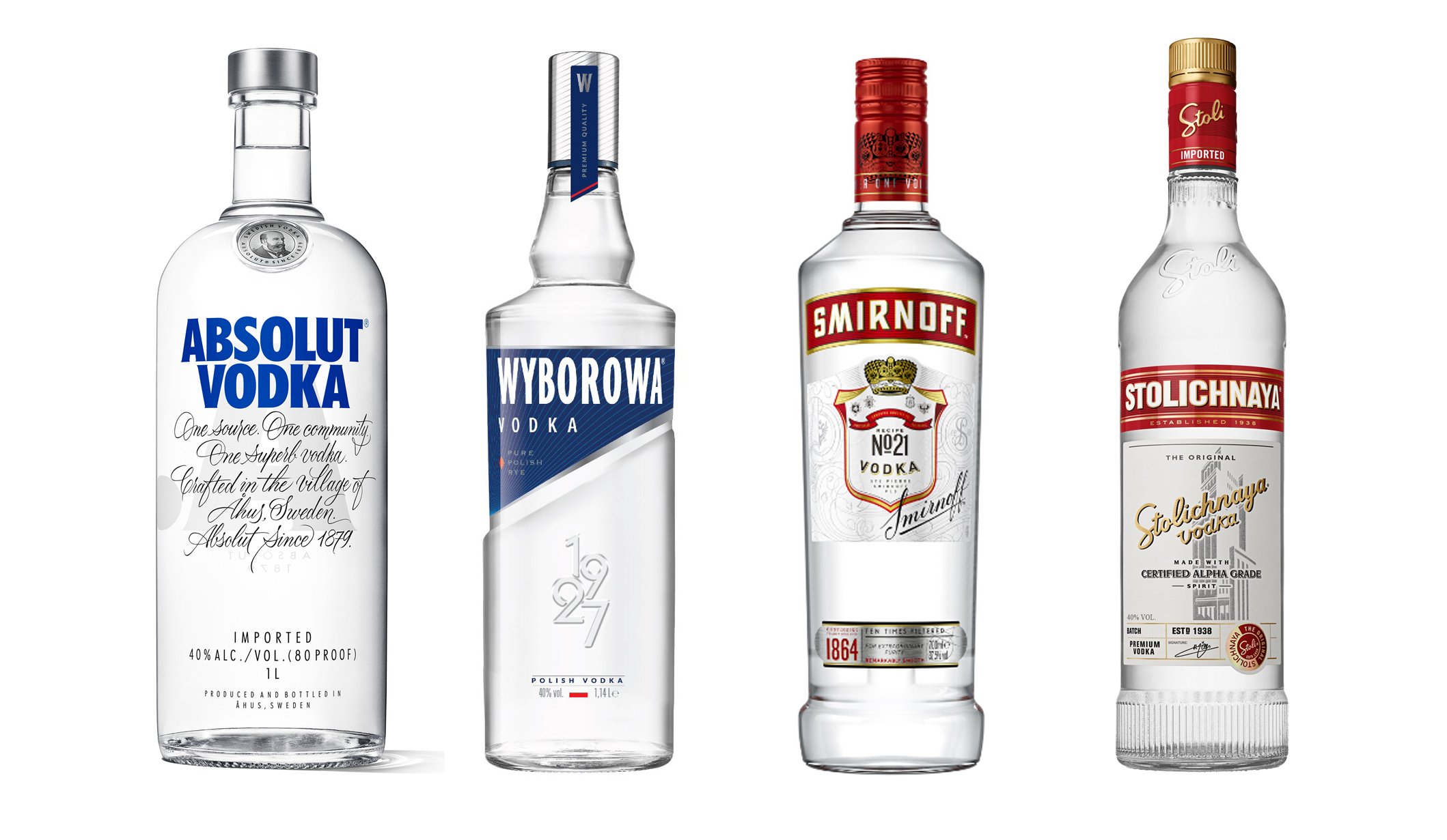
Absolut Vodka and competitors bottle design today.
In 2015, Absolut Vodka was re-designed, but the other brands had also undergone design changes a few years before. These changes were more evident than Absolut’s, looking back at the pack from 1980. We can see how the competitors, to the exception of Stolichnaya, went for a see-through label and printed bottle in order to gain more relevance, and also to look more modern. It is almost like every other brand was following what Absolut Vodka had already done since its conception.
Absolut Vodka and competitors (1980 vs 2021).
“I sadly have to say that, Absolut Vodka, has lost its positioning of uniqueness and creativity.”
And finally in 2021 Absolut Vodka was re-designed again. When you look at the current line up you can see how they are looking so similar to one another. Although the bottle shapes are unique for each brand, and they play a huge part in this, the other assets cross over the different brand labels. We can see how Smirnoff and Stolinchnaya are already using a label with product information, just like Absolut Vodka had introduced in its new design, or the way the script fonts are used in similar ways and how different it was from Absolut Vodka’s years ago.
I sadly have to say that when others had improved their designs over the years, Absolut Vodka, as disruptive as it was back then, has lost its positioning of uniqueness and creativity, to become one more in the vodka lot with this new design.
Previous Absolut Vodka, and competitors bottle design from today.
Specially when we line up the 2015 with the others from today, we can see how more unique the Absolut Vodka design was before their 2021 re-design.
See on the next post…
Let’s talk
From brand creation to brand extension, from packaging design to point of sale communication. Whether you are thinking to launch a new brand or redesigning your existing one, I am here to help you in that journey.
Drop me a line about your project or simply book a free intro session here to discuss your project and see how can I help. Looking foward to hearing from you